微信小程序组件
参考 https://developers.weixin.qq.com/miniprogram/dev/framework/ability/custom-tabbar.html
自定义tabBar
自定义 tabBar 可以让开发者更加灵活地设置 tabBar 样式,以满足更多个性化的场景。
在自定义 tabBar 模式下
为了保证低版本兼容以及区分哪些页面是 tab 页,tabBar 的相关配置项需完整声明,但这些字段不会作用于自定义 tabBar 的渲染。 此时需要开发者提供一个自定义组件来渲染 tabBar,所有 tabBar 的样式都由该自定义组件渲染。推荐用 fixed 在底部的 cover-view + cover-image 组件渲染样式,以保证 tabBar 层级相对较高。 与 tabBar 样式相关的接口,如 wx.setTabBarItem 等将失效。 每个 tab 页下的自定义 tabBar 组件实例是不同的,可通过自定义组件下的 getTabBar 接口,获取当前页面的自定义 tabBar 组件实例。 注意:如需实现 tab 选中态,要在当前页面下,通过 getTabBar 接口获取组件实例,并调用 setData 更新选中态。可参考底部的代码示例。
使用
- 配置信息
- 在 app.json 中的 tabBar 项指定 custom 字段,同时其余 tabBar 相关配置也补充完整。
- 所有 tab 页的 json 里需声明 usingComponents 项,也可以在 app.json 全局开启。
{
"tabBar": {
"custom": true,
"color": "#000000",
"selectedColor": "#000000",
"backgroundColor": "#000000",
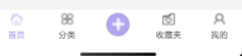
"list": [{
"pagePath": "page/component/index",
"text": "组件"
}, {
"pagePath": "page/API/index",
"text": "接口"
}]
},
"usingComponents": {}
}
- 添加 tabBar 代码文件
在代码根目录下添加入口文件:
custom-tab-bar/index.js custom-tab-bar/index.json custom-tab-bar/index.wxml custom-tab-bar/index.wxss 3. 编写 tabBar 代码
用自定义组件的方式编写即可,该自定义组件完全接管 tabBar 的渲染。另外,自定义组件新增 getTabBar 接口,可获取当前页面下的自定义 tabBar 组件实例
以下是一个简单的自定义 tabBar 组件示例:
<view class="tabbar">
	<view class="tabbar-item {{ select === index ? 'tabbar-select' : '' }}" wx:for="{{ list }}" wx:key="index" data-page="{{ item.pagePath }}" data-index="{{ index }}" data-type="{{ item.type }}" bindtap="selectPage">
		<block wx:if="{{ item.type === 0 }}">
			<image class="tabbar-image" src="{{ select === index ?  item.selectedIconPath : item.iconPath }}"></image>
			<text class="tabbar-text">{{ item.text }}</text>
		</block>
		<block wx:else>
			<view class="publish">
				<image class="tabbar-image" src="../images/add.png"></image>
			</view>
		</block>
	</view>
</view>
Component({
	data: {
		select: 0,
		list: [
			{
				iconPath: "/images/index.png",
				pagePath: "/pages/index/index",
				selectedIconPath: "/images/index_fill.png",
				text: "首页",
				type: 0
			},
			{
				iconPath: "/images/classify.png",
				pagePath: "/pages/classify/classify",
				selectedIconPath: "/images/classify_fill.png",
				text: "分类",
				type: 0
			},
			{
				type: 1,
				pagePath: "/pages/publish/publish",
			},
			{
				iconPath: "/images/collection.png",
				pagePath: "/pages/collection/collection",
				selectedIconPath: "/images/collection_fill.png",
				text: "收藏夹",
				type: 0,
			},
			{
				iconPath: "/images/me.png",
				pagePath: "/pages/me/me",
				selectedIconPath: "/images/me_fill.png",
				text: "我的",
				type: 0
			}
		]
	},

	methods: {
		selectPage(e) {
			const { index, page, type } = e.currentTarget.dataset
			if (index !== this.data.select && type === 0) {
				wx.switchTab({
					url: page,
				})
			}
			if (type === 1) {
				wx.navigateTo({
					url: '../../pages/publish/publish',
				})
			}
			this.setData({
        select: index
      })
		}
	}
})
.tabbar {
	width: 100%;
	height: 80rpx;
	display: flex;
	background-color: #fff;
	position: fixed;
	bottom: 0;
	padding-bottom: env(safe-area-inset-bottom);
	padding-top: 10rpx;
	z-index: 9999;
}

.tabbar-item {
	flex: 1;
	display: flex;
	flex-direction: column;
	justify-content: center;
	align-items: center;
}

.tabbar-item .tabbar-image {
	width: 40rpx;
	height: 40rpx;
}

.tabbar-item .tabbar-text {
	font-size: 26rpx;
	margin-top: 10rpx;
}

.tabbar-item .publish {
	padding: 8px;
	background-color: #B2A4EC;
	border-radius: 50%;
	display: flex;
	align-items: center;
	justify-content: center;
	margin-bottom: auto;
}

.tabbar-select {
	color: #B2A4EC;
}
skyline 模式
使用 skyline 渲染模式的时候,需要进行如下适配:
- tabBar 组件样式兼容
- tabBar 根组件需要添加
pointer-events: auto - tabBar 根组件定位需为
position: absolute
- tabBar 根组件需要添加
<view class="tab-bar">
  <!-- tabbar item-->
</view>
.tab-bar {
  pointer-events: auto;
  position: absolute;
}
- getTabBar 回调函数 skyline 模式下,页面/组件上的 getTabBar 接口为异步回调的方式获取 tabBar 实例
Page({
  getInstance() {
    if (typeof this.getTabBar === 'function' ) {
      this.getTabBar((tabBar) => {
        tabBar.setData({
          selected: 0
        })
      })
    }
  }
})
onShow() {
  if (typeof this.getTabBar === "function" && this.getTabBar()) {
    this.getTabBar().setData({
      select: 4
    })
  }
}