微信小程序组件
https://developers.weixin.qq.com/miniprogram/dev/component/
html 中有 div、span、ul、li 、img, 而小程序上面所有的标签都没有,只有组件, 微信小程序中的组件就相当于之前HTML中的标签。但是小程序中的组件除了包裹功能,还具有样式和 js 功能。
以下会介绍一些常用的标签, 剩下的可以在官方文档中查看
视图/基础组件
View
视图容器,view组件就相当于之前HTML中的div标签。
| 属性 | 类型 | 默认值 | 必填 | 说明 | 最低版本 |
|---|---|---|---|---|---|
| hover-class | string | none | 否 | 指定按下去的样式类。当 hover-class="none" 时,没有点击态效果 | 1.0.0 |
| hover-stop-propagation | boolean | false | 否 | 指定是否阻止本节点的祖先节点出现点击态 | 1.5.0 |
| hover-start-time | number | 50 | 否 | 按住后多久出现点击态,单位毫秒 | 1.0.0 |
| hover-stay-time | number | 400 | 否 | 手指松开后点击态保留时间,单位毫秒 | 1.0.0 |
<view class="wrapper" hover-class="wrapper-hover" hover-stay-time="1000">我的第一个微信程序</view>
.wrapper{
	width: 100%;
	height: 100rpx;
	text-align: center;
	line-height: 100rpx;
	background-color: skyblue;
}

.wrapper-hover {
	background-color: pink;
}
以下是一个 Flex 布局的例子
<view class="container">
  <view class="page-body">
    <view class="page-section">
      <view class="page-section-title">
        <text>flex-direction: row</text>
        <text>横向布局</text>
      </view>
      <view class="page-section-spacing">
        <view class="flex-wrp" style="flex-direction:row;">
          <view class="flex-item demo-text-1"></view>
          <view class="flex-item demo-text-2"></view>
          <view class="flex-item demo-text-3"></view>
        </view>
      </view>
    </view>
    <view class="page-section">
      <view class="page-section-title">
        <text>flex-direction: column</text>
        <text>纵向布局</text>
      </view>
      <view class="flex-wrp" style="flex-direction:column;">
        <view class="flex-item flex-item-V demo-text-1"></view>
        <view class="flex-item flex-item-V demo-text-2"></view>
        <view class="flex-item flex-item-V demo-text-3"></view>
      </view>
    </view>
  </view>
</view>
.container {
	margin-top: 80px;
}

.flex-wrp {
	display: flex;
}

.flex-item {
	width: 200rpx;
	height: 300rpx;
	font-size: 26rpx;
}

.flex-item-V {
	margin: 0 auto;
	width: 300rpx;
	height: 200rpx;
}

.page-section-title text {
	line-height: 36px;
}

.demo-text-1 {
	position: relative;
	align-items: center;
	justify-content: center;
	background-color: #1AAD19;
	color: #FFFFFF;
	font-size: 36rpx;
}

.demo-text-1:before {
	content: 'A';
	position: absolute;
	top: 50%;
	left: 50%;
	transform: translate(-50%, -50%);
}

.demo-text-2 {
	position: relative;
	align-items: center;
	justify-content: center;
	background-color: #2782D7;
	color: #FFFFFF;
	font-size: 36rpx;
}

.demo-text-2:before {
	content: 'B';
	position: absolute;
	top: 50%;
	left: 50%;
	transform: translate(-50%, -50%);
}

.demo-text-3 {
	position: relative;
	align-items: center;
	justify-content: center;
	background-color: #F1F1F1;
	color: #353535;
	font-size: 36rpx;
}

.demo-text-3:before {
	content: 'C';
	position: absolute;
	top: 50%;
	left: 50%;
	transform: translate(-50%, -50%);
}

text
文本组件,相当于HTML中的span标签。
<text>啦啦啦啦</text>
swiper
https://developers.weixin.qq.com/miniprogram/dev/component/swiper.html#%E6%B8%B2%E6%9F%93%E6%A8%A1%E5%BC%8F%E6%95%88%E6%9E%9C%E6%BC%94%E7%A4%BA
滑块视图容器。其中只可放置swiper-item组件,否则会导致未定义的行为。也就是说swiper内部只能放swiper-item组件,而swiper-item组件中就可以随便放其它组件及内容了。
<swiper class="banner">
  <swiper-item>item1</swiper-item>
  <swiper-item>item2</swiper-item>
  <swiper-item>item3</swiper-item>
</swiper>
.banner{
    height: 80rpx;
    text-align: center;
    line-height: 80rpx;
}
可以看到swiper组件有轮播图的效果。而且它有默认的高度(150px)。
| 属性 | 类型 | 默认值 | 必填 | 说明 | 最低版本 | |
|---|---|---|---|---|---|---|
| indicator-dots | boolean | false | 否 | 是否显示面板指示点 | 1.0.0 | |
| indicator-color | color | rgba(0, 0, 0, .3) | 否 | 指示点颜色 | 1.1.0 | |
| indicator-active-color | color | #000000 | 否 | 当前选中的指示点颜色 | 1.1.0 | |
| autoplay | boolean | false | 否 | 是否自动切换 | 1.0.0 | |
| current | number | 0 | 否 | 当前所在滑块的 index | 1.0.0 | |
| interval | number | 5000 | 否 | 自动切换时间间隔 | 1.0.0 | |
| duration | number | 500 | 否 | 滑动动画时长 | 1.0.0 | |
| circular | boolean | false | 否 | 是否采用衔接滑动 | 1.0.0 | |
| vertical | boolean | false | 否 | 滑动方向是否为纵向 | 1.0.0 | |
| display-multiple-items | number | 1 | 否 | 同时显示的滑块数量 | 1.9.0 | |
| previous-margin | string | "0px" | 否 | 前边距,可用于露出前一项的一小部分,接受 px 和 rpx 值 | 1.9.0 |
以下是一个简单的轮播图效果
const food = [
	'https://img1.baidu.com/it/u=3033226715,2238019049&fm=253&fmt=auto&app=138&f=JPEG?w=800&h=500',
	'https://img1.baidu.com/it/u=1948650034,2409824853&fm=253&fmt=auto&app=120&f=JPEG?w=1200&h=675',
	'https://img2.baidu.com/it/u=3016274568,4110305242&fm=253&fmt=auto&app=138&f=JPEG?w=500&h=313',
	'https://img2.baidu.com/it/u=2364493189,83457107&fm=253&fmt=auto&app=138&f=JPEG?w=800&h=500'
]

Page({
	data: {
		food
	},
})
<view style="height: 400rpx;">
	<swiper class="banner" indicator-dots>
		<swiper-item wx:for="{{food}}" wx:key="*this">
			<image class="img" src="{{item}}" mode="aspectFill" />
		</swiper-item>
	</swiper>
</view>
.banner {
	height: 100%;
	width: 100%;
	text-align: center;
	line-height: 80rpx;
}
当然, 在 Skyline 渲染模式下, 他也会有不同的表现, 具体可以看
https://developers.weixin.qq.com/miniprogram/dev/component/swiper.html#%E6%8C%87%E7%A4%BA%E5%99%A8%E6%95%88%E6%9E%9C%E6%BC%94%E7%A4%BA
scroll-view
https://developers.weixin.qq.com/miniprogram/dev/component/scroll-view.html
可滚动视图区域。使用竖向滚动时,需要给scroll-view一个固定高度,通过 WXSS 设置 height。组件属性的长度单位默认为px,2.4.0起支持传入单位(rpx/px)。
- 横向滚动需打开 enable-flex 以兼容 WebView,如
- 滚动条的长度是预估的,若直接子节点的高度差别较大,则滚动条长度可能会不准确
- 使用
worklet函数需要开启开发者工具 "将 JS 编译成 ES5" 或 "编译 worklet 函数" 选项。
以下我会给出 纵向滚动 以及 横向滚动 两个效果, 具体属性可以在官方文档中查看
<view class="container">
  <view class="page-body">
    <view class="page-section">
      <view class="page-section-title">
        <text>Vertical Scroll</text>
        <text>纵向滚动</text>
      </view>
      <view class="page-section-spacing">
        <scroll-view type="list" scroll-y="true" style="height: 300rpx;">
          <view id="demo1" class="scroll-view-item demo-text-1"></view>
          <view id="demo2"  class="scroll-view-item demo-text-2"></view>
          <view id="demo3" class="scroll-view-item demo-text-3"></view>
        </scroll-view>
      </view>
    </view>
    <view class="page-section">
      <view class="page-section-title">
        <text>Horizontal Scroll</text>
        <text>横向滚动</text>
      </view>
      <view class="page-section-spacing">
        <scroll-view type="list" class="scroll-view_H"  scroll-x="true" bindscroll="scroll" style="width: 100%;height: 300rpx;">
          <view id="demo1" class="scroll-view-item_H demo-text-1"></view>
          <view id="demo2"  class="scroll-view-item_H demo-text-2"></view>
          <view id="demo3" class="scroll-view-item_H demo-text-3"></view>
        </scroll-view>
      </view>
    </view>
  </view>
</view>
Page({
  tapMove() {
    this.setData({
      scrollTop: this.data.scrollTop + 10
    })
  }
})
.container {
	margin-top: 80px;
}

.page-section-spacing {
	margin-top: 60rpx;
}

.scroll-view_H {
	white-space: nowrap;
}

.scroll-view-item {
	height: 300rpx;
}

.scroll-view-item_H {
	display: inline-block;
	width: 100%;
	height: 300rpx;
}

.demo-text-1 {
	position: relative;
	align-items: center;
	justify-content: center;
	background-color: #1AAD19;
	color: #FFFFFF;
	font-size: 36rpx;
}

.demo-text-1::before {
	content: 'A';
	position: absolute;
	top: 50%;
	left: 50%;
	transform: translate(-50%, -50%);
}

.demo-text-2 {
	position: relative;
	align-items: center;
	justify-content: center;
	background-color: #2782D7;
	color: #FFFFFF;
	font-size: 36rpx;
}

.demo-text-2::before {
	content: 'B';
	position: absolute;
	top: 50%;
	left: 50%;
	transform: translate(-50%, -50%);
}

.demo-text-3 {
	position: relative;
	align-items: center;
	justify-content: center;
	background-color: #F1F1F1;
	color: #353535;
	font-size: 36rpx;
}

.demo-text-3::before {
	content: 'C';
	position: absolute;
	top: 50%;
	left: 50%;
	transform: translate(-50%, -50%);
}
https://developers.weixin.qq.com/miniprogram/dev/component/scroll-view.html#scroll-view-%E8%87%AA%E5%AE%9A%E4%B9%89%E4%B8%8B%E6%8B%89%E5%88%B7%E6%96%B0%E7%A4%BA%E4%BE%8B
以下是横向滚动案例
<!-- scroll-view -->
<scroll-view class="myScroll" scroll-x>
	<view class="myScroll.row">1</view>
	<view class="row">2</view>
	<view class="row">3</view>
	<view class="row">4</view>
	<view class="row">5</view>
	<view class="row">6</view>
	<view class="row">7</view>
	<view class="row">8</view>
</scroll-view>
.myScroll {
	width: 100%;
	height: 220rpx;
	background: #eee;
	/* 使文本在不换行的情况下继续显示 */
	white-space: nowrap;
}

.myScroll .row {
	width: 220rpx;
	height: 220rpx;
	background: burlywood;
	margin-right: 20rpx;
	display: inline-block;
}

.myScroll .row:last-child {
	margin-right: 0;
}
icon
icon组件就是在页面可以显示一个图标。
<icon type="success"></icon>
<icon type="success" size="50"></icon>
<icon type="warn"></icon>
| 属性 | 类型 | 默认值 | 必填 | 说明 | 最低版本 |
|---|---|---|---|---|---|
| type | string | 是 | icon的类型,有效值:success, success_no_circle, info, warn, waiting, cancel, download, search, clear | 1.0.0 | |
| size | number/string | 23 | 否 | icon的大小,单位默认为px,2.4.0起支持传入单位(rpx/px),2.21.3起支持传入其余单位(rem 等)。 | 1.0.0 |
| color | string | 否 | icon的颜色,同css的color | 1.0.0 |
progress 进度条
进度条。组件属性的长度单位默认为px,2.4.0起支持传入单位(rpx/px)。
| 属性 | 类型 | 默认值 | 必填 | 说明 | 最低版本 |
|---|---|---|---|---|---|
| percent | number | 否 | 百分比0~100 | 1.0.0 | |
| show-info | boolean | false | 否 | 在进度条右侧显示百分比 | 1.0.0 |
| border-radius | number/string | 0 | 否 | 圆角大小 | 2.3.1 |
| font-size | number/string | 16 | 否 | 右侧百分比字体大小 | 2.3.1 |
| stroke-width | number/string | 6 | 否 | 进度条线的宽度 | 1.0.0 |
| color | string | #09BB07 | 否 | 进度条颜色(请使用activeColor) | 1.0.0 |
| activeColor | string | #09BB07 | 否 | 已选择的进度条的颜色 | 1.0.0 |
| backgroundColor | string | #EBEBEB | 否 | 未选择的进度条的颜色 | 1.0.0 |
| active | boolean | false | 否 | 进度条从左往右的动画 | 1.0.0 |
| active-mode | string | backwards | 否 | backwards: 动画从头播;forwards:动画从上次结束点接着播 | 1.7.0 |
| duration | number | 30 | 否 | 进度增加1%所需毫秒数 | 2.8.2 |
| bindactiveend | eventhandle | 否 | 动画完成事件 | 2.4.1 |
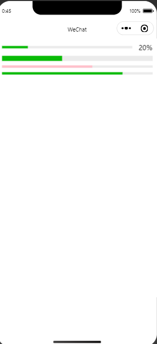
<progress percent="20" show-info />
<progress percent="40" stroke-width="12" />
<progress percent="60" color="pink" />
<progress percent="80" active />
表单组件
具体可以在官方文档查看
Button
https://developers.weixin.qq.com/miniprogram/dev/component/button.html
具体属性看官方文档, 可以通过
open-type配置分享, 打开交流窗口等等功能
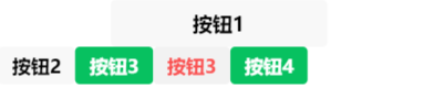
<button size="default">按钮1</button>
<button size="mini">按钮2</button>
<button size="mini" type="primary">按钮3</button>
<button size="mini" type="warn">按钮3</button>
<button size="mini" type="primary" open-type="share">按钮4</button>
导航组件
navigator
https://developers.weixin.qq.com/miniprogram/dev/component/navigator.html
navigator组件相当于HTML的超链接标签。
<!--
  navigator组件相当于HTML的超链接标签。
    target属性:在哪个目标上发生跳转,默认self-当前小程序;
    url属性:当前小程序内的跳转链接
    open-type属性:指定跳转方式,默认是navigate
      navigate:保留当前页面,跳转到应用内的某个页面。但是不能跳到 tabbar 页面。
      redirect:关闭当前页面,跳转到应用内的某个页面。但是不允许跳转到 tabbar 页面。
      switchTab:跳转到 tabBar 页面,并关闭其他所有非 tabBar 页面
      reLaunch:关闭所有页面,打开到应用内的某个页面
      navigateBack:关闭当前页面,返回上一页面或多级页面。
 -->
<navigator target="self" url="../about/about" open-type="switchTab">点我跳转</navigator>
<!-- 导航
跳转到页面,都不写后缀名
1、open-type='navigate' 跳转方式:
保留当前页面,跳转应用内的某个页面,但不跳转tabber页面
2、open-type="redirect 关闭当前页面,跳转到应用内的某个页面。但是不允许跳转到 tabbar 页面。 没返回,有返回首页
3、open-type="switchTab"  跳转到 tabBar 页面,并关闭其他所有非 tabBar 页面
4、reLaunch 关闭所有页面,打开到应用内的某个页面
5、navigateBack 关闭当前页面,返回上一页面或多级页面。标签的话,就是返回上一页。用方法的话,可以指定返回多少级
6、exit	退出小程序,`target="miniProgram"`时生效 需要用真机去测

-->
<navigator url="../detail/detail">进入详情页</navigator>
<navigator url="../detail/detail" open-type="redirect">redirect 进入详情页</navigator>
<navigator url="../index/index" open-type="switchTab">跳转到首页</navigator>
<!-- 还可以调tabBar -->
<navigator url="../detail/detail" open-type="reLaunch">reLaunch 到详情页</navigator>
<navigator open-type="exit" target="miniProgram">退出小程序</navigator>
媒体组件
image
https://developers.weixin.qq.com/miniprogram/dev/component/image.html
为了保证大小, 可以使用裁剪或者缩放调整大小
| 属性 | 类型 | 默认值 | 必填 | 说明 | 最低版本 | |
|---|---|---|---|---|---|---|
| show-menu-by-longpress | boolean | false | 否 | 长按图片显示发送给朋友、收藏、保存图片、搜一搜、打开名片/前往群聊/打开小程序(若图片中包含对应二维码或小程序码)的菜单。 | 2.7.0 | |
| mode | string | scaleToFill | 否 | 图片裁剪、缩放的模式 | 1.0.0 |
| 合法值 | 说明 | 最低版本 |
| scaleToFill | 缩放模式,不保持纵横比缩放图片,使图片的宽高完全拉伸至填满 image 元素 | |
| aspectFit | 缩放模式,保持纵横比缩放图片,使图片的长边能完全显示出来。也就是说,可以完整地将图片显示出来。 | |
| aspectFill | 缩放模式,保持纵横比缩放图片,只保证图片的短边能完全显示出来。也就是说,图片通常只在水平或垂直方向是完整的,另一个方向将会发生截取。 | |
| widthFix | 缩放模式,宽度不变,高度自动变化,保持原图宽高比不变 | |
| heightFix | 缩放模式,高度不变,宽度自动变化,保持原图宽高比不变 | 2.10.3 |
| top | 裁剪模式,不缩放图片,只显示图片的顶部区域。仅 Webview 支持。 | |
| bottom | 裁剪模式,不缩放图片,只显示图片的底部区域。仅 Webview 支持。 | |
| center | 裁剪模式,不缩放图片,只显示图片的中间区域。仅 Webview 支持。 | |
| left | 裁剪模式,不缩放图片,只显示图片的左边区域。仅 Webview 支持。 | |
| right | 裁剪模式,不缩放图片,只显示图片的右边区域。仅 Webview 支持。 | |
| top left | 裁剪模式,不缩放图片,只显示图片的左上边区域。仅 Webview 支持。 | |
| top right | 裁剪模式,不缩放图片,只显示图片的右上边区域。仅 Webview 支持。 | |
| bottom left | 裁剪模式,不缩放图片,只显示图片的左下边区域。仅 Webview 支持。 | |
| bottom right | 裁剪模式,不缩放图片,只显示图片的右下边区域。仅 Webview 支持。 |
可以在 https://developers.weixin.qq.com/miniprogram/dev/component/image.html#%E7%A4%BA%E4%BE%8B%E4%BB%A3%E7%A0%81 查看示例代码
地图组件
https://developers.weixin.qq.com/miniprogram/dev/component/map.html
<!--
  latitude:维度
  longitude:经度
 -->
<map longitude="115" latitude="39"></map>