ArkUI 基础组件
基础组件
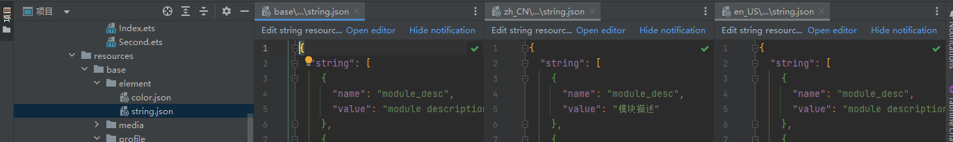
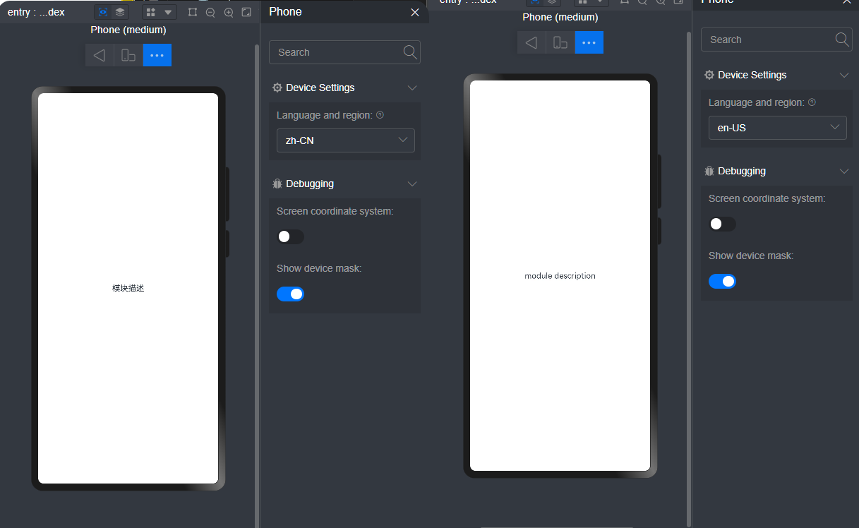
Text
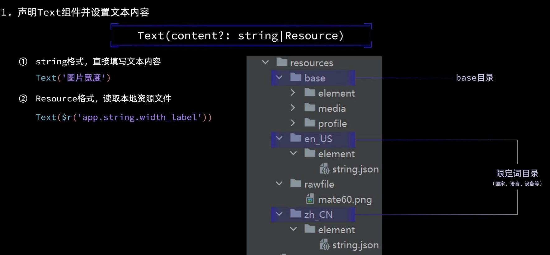
Text($r("app.string.module_desc"))
文本会先在对应国家的资源文件中查找,如果没有找到,会在 base 全局资源文件中查找。
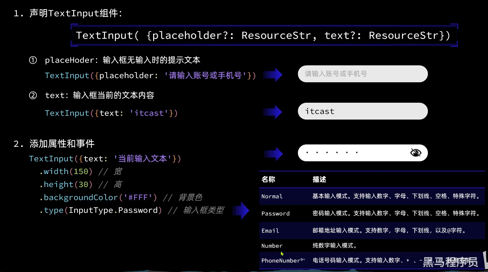
TextInput
Button
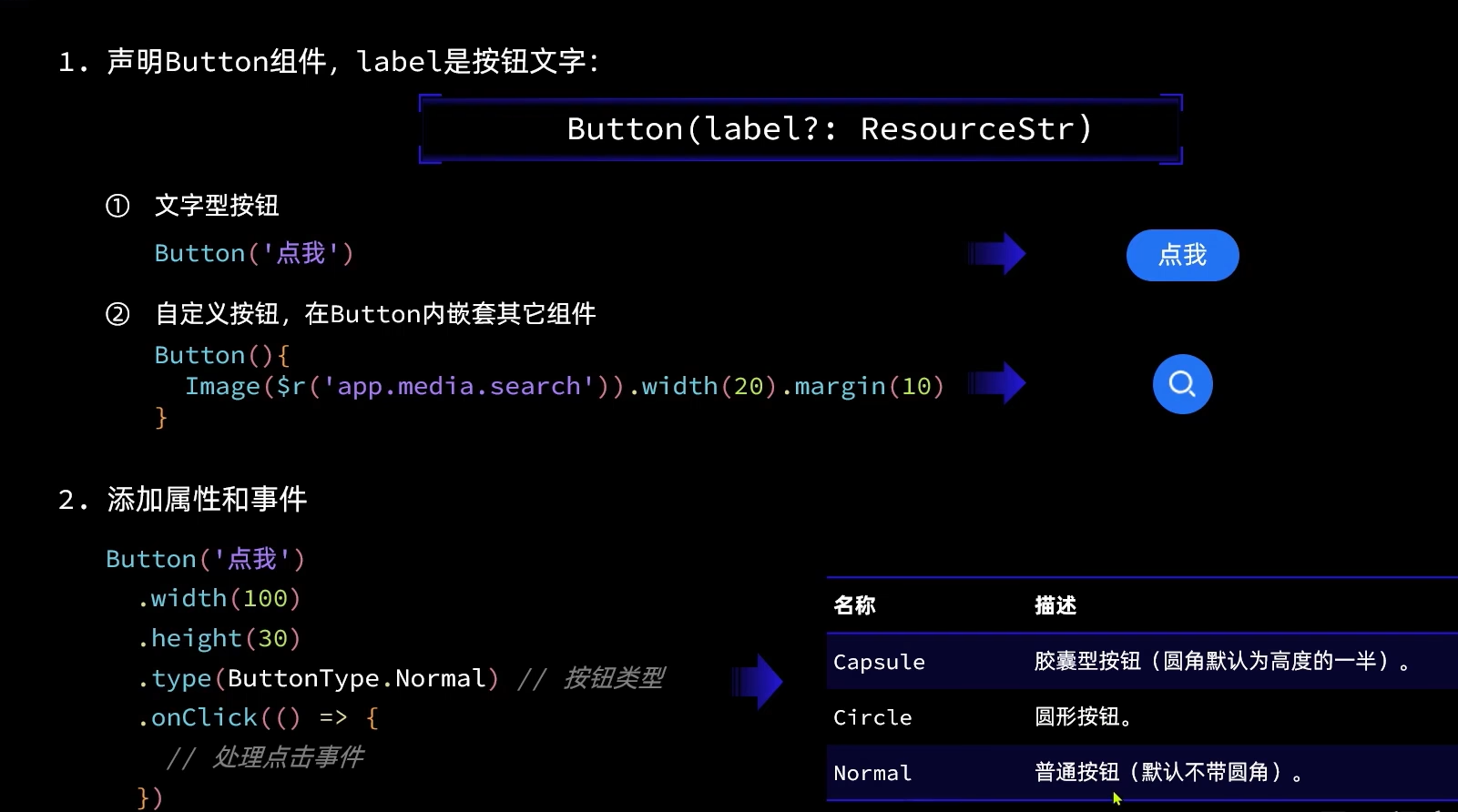
方法1: Button(options?: {type?: ButtonType, stateEffect?: boolean})
方法2: Button(label?: ResourceStr, options?: { type?: ButtonType, stateEffect?: boolean })
使用文本内容创建相应的按钮组件,此时Button无法包含子组件。
Image
图片组件,支持本地图片和网络图片的渲染展示。
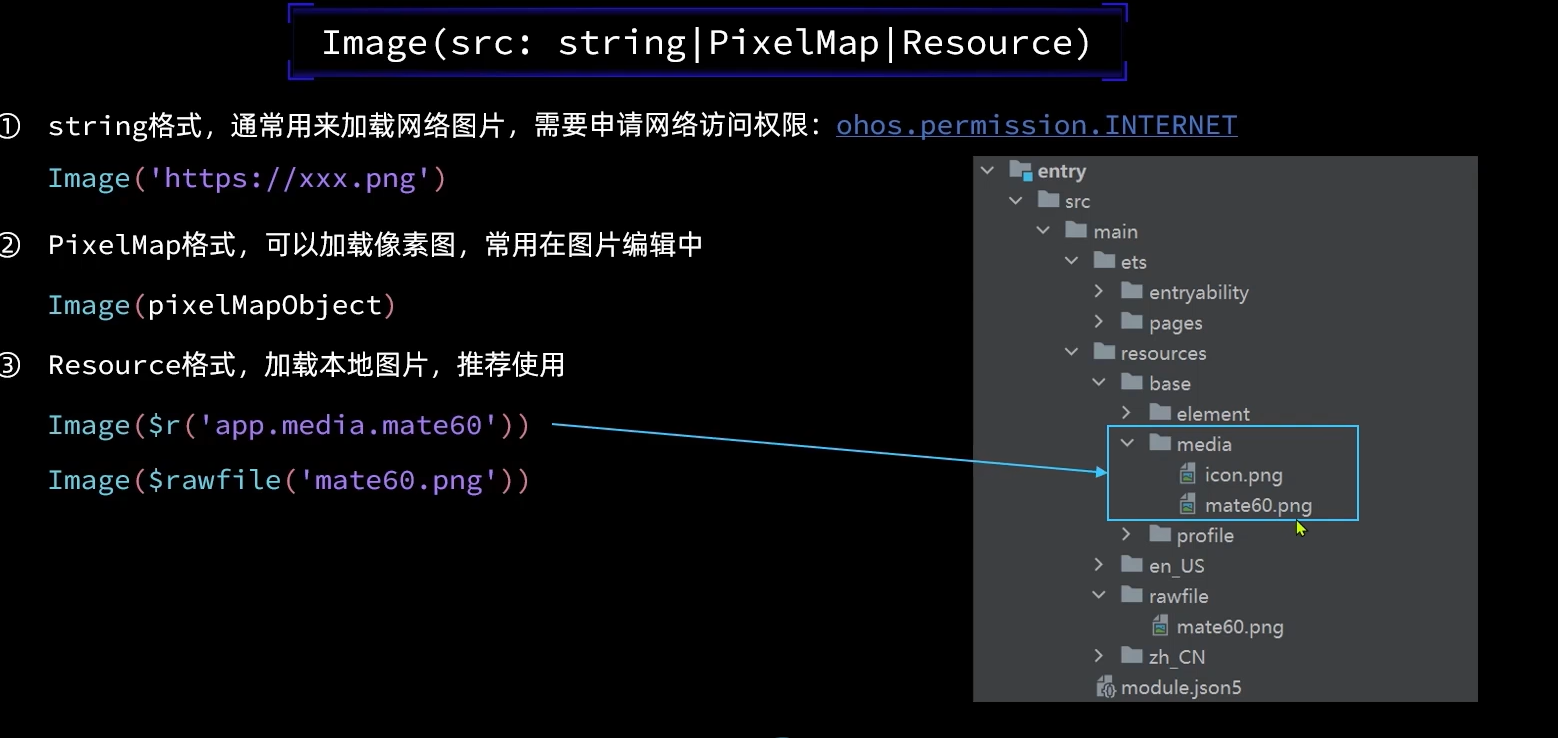
Image(src: string | PixelMap | Resource) 图片的数据源,支持本地图片和网络图片。当使用相对路径引用图片资源时,例如Image("common/test.jpg"),不支持该Image组件被跨包/跨模块调用,建议使用$r方式来管理需全局使用的图片资源。
- 支持的图片格式包括png、jpg、bmp、svg和gif。
- 支持Base64字符串。格式data:image/[png|jpeg|bmp|webp];base64,[base64 data], 其中[base64 data]为Base64字符串数据。
- 支持dataability://路径前缀的字符串,用于访问通过data ability提供的图片路径。
从网络加载图片
使用网络图片时,需要申请权限ohos.permission.INTERNET。具体申请方式请参考权限申请声明。
// entry/src/main/module.json5

{
  "module": {
    "reqPermissions": [
      {
        "name": "ohos.permission.INTERNET",
      }
    ]
  }
}
通过以下代码,可以加载网络图片:
Image("https://example.com/image.jpg")
从本地加载
Image($r("app.media.icon"))

Image($rawfile("abstract.png"))
Slider
Slider({
  min: 0, // 最小值
  max: 100, // 最大值
  value: 40, // 当前值
  step: 10, // 步长
  style: SliderStyle.InSet, // Outer Slider
  direction: Axis.Horizontal, // 方向
  reverse: false // 方向滑动
})
  .showTips(true) // 展示 value 百分比
  .margin({
    top: 20
  })
容器组件
https://developer.huawei.com/consumer/cn/doc/harmonyos-references-V3/arkui-ts-container-components-0000001334734185-V3
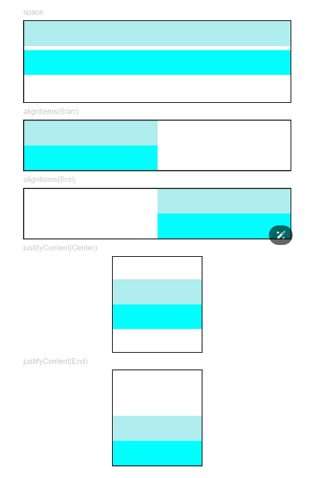
Column
沿垂直方向布局的容器。
@Entry
@Component
struct ColumnExample {
  build() {
    Column() {
        Text('space').fontSize(9).fontColor(0xCCCCCC).width('90%')
        Column({ space: 5 }) {
          Column().width('100%').height(30).backgroundColor(0xAFEEEE)
          Column().width('100%').height(30).backgroundColor(0x00FFFF)
        }.width('90%').height(100).border({ width: 1 })

        Text('alignItems(Start)').fontSize(9).fontColor(0xCCCCCC).width('90%')
        Column() {
          Column().width('50%').height(30).backgroundColor(0xAFEEEE)
          Column().width('50%').height(30).backgroundColor(0x00FFFF)
        }.alignItems(HorizontalAlign.Start).width('90%').border({ width: 1 })

        Text('alignItems(End)').fontSize(9).fontColor(0xCCCCCC).width('90%')
        Column() {
          Column().width('50%').height(30).backgroundColor(0xAFEEEE)
          Column().width('50%').height(30).backgroundColor(0x00FFFF)
        }.alignItems(HorizontalAlign.End).width('90%').border({ width: 1 })

        Text('justifyContent(Center)').fontSize(9).fontColor(0xCCCCCC).width('90%')
        Column() {
          Column().width('30%').height(30).backgroundColor(0xAFEEEE)
          Column().width('30%').height(30).backgroundColor(0x00FFFF)
        }.height('15%').border({ width: 1 }).justifyContent(FlexAlign.Center)

        Text('justifyContent(End)').fontSize(9).fontColor(0xCCCCCC).width('90%')
        Column() {
          Column().width('30%').height(30).backgroundColor(0xAFEEEE)
          Column().width('30%').height(30).backgroundColor(0x00FFFF)
        }.height('15%').border({ width: 1 }).justifyContent(FlexAlign.End)
    }.width('100%').padding({ top: 5 })
  }
}
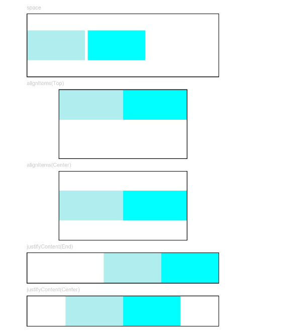
Row
沿水平方向布局容器。
// xxx.ets
@Entry
@Component
struct RowExample {
  build() {
    Column({ space: 5 }) {
      Text('space').fontSize(9).fontColor(0xCCCCCC).width('90%')
        Row({ space: 5 }) {
          Row().width('30%').height(50).backgroundColor(0xAFEEEE)
          Row().width('30%').height(50).backgroundColor(0x00FFFF)
        }.width('90%').height(107).border({ width: 1 })

        Text('alignItems(Top)').fontSize(9).fontColor(0xCCCCCC).width('90%')
        Row() {
          Row().width('30%').height(50).backgroundColor(0xAFEEEE)
          Row().width('30%').height(50).backgroundColor(0x00FFFF)
        }.alignItems(VerticalAlign.Top).height('15%').border({ width: 1 })

        Text('alignItems(Center)').fontSize(9).fontColor(0xCCCCCC).width('90%')
        Row() {
          Row().width('30%').height(50).backgroundColor(0xAFEEEE)
          Row().width('30%').height(50).backgroundColor(0x00FFFF)
        }.alignItems(VerticalAlign.Center).height('15%').border({ width: 1 })

        Text('justifyContent(End)').fontSize(9).fontColor(0xCCCCCC).width('90%')
        Row() {
          Row().width('30%').height(50).backgroundColor(0xAFEEEE)
          Row().width('30%').height(50).backgroundColor(0x00FFFF)
        }.width('90%').border({ width: 1 }).justifyContent(FlexAlign.End)

        Text('justifyContent(Center)').fontSize(9).fontColor(0xCCCCCC).width('90%')
        Row() {
          Row().width('30%').height(50).backgroundColor(0xAFEEEE)
          Row().width('30%').height(50).backgroundColor(0x00FFFF)
        }.width('90%').border({ width: 1 }).justifyContent(FlexAlign.Center)
    }.width('100%')
  }
}
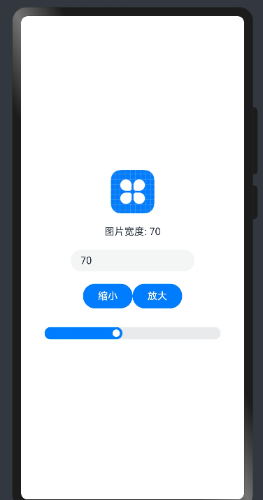
案例
// xxx.ets
@Entry
@Component
struct Index {
  @State imgWidth: number = 30

  build() {
    Row() {
      Column() {
        Image($r("app.media.icon"))
          .width(this.imgWidth)
          .interpolation(ImageInterpolation.High)

        Text(`图片宽度: ${this.imgWidth}`)
          .margin(20)

        TextInput({
          placeholder: "请输入图片宽度",
          text: this.imgWidth.toString()
        })
          .width(200)
          .type(InputType.Number)
          .onChange(value => {
            this.imgWidth = parseInt(value)
          })
        Row() {
          Button("缩小")
            .width(80)
            .onClick(() => {
              if (this.imgWidth >= 10) {
                this.imgWidth -= 10
              }
            })

          Button("放大")
            .width(80)
            .onClick(() => {
              if (this.imgWidth <= 300) {
                this.imgWidth += 10
              }
            })
        }
        .margin({
          top: 20
        })

        Slider({
          min: 0, // 最小值
          max: 100, // 最大值
          value: 40, // 当前值
          step: 10, // 步长
          style: SliderStyle.InSet, // Outer Slider
          direction: Axis.Horizontal, // 方向
          reverse: false // 方向滑动
        })
          .showTips(true) // 展示 value 百分比
          .margin({
            top: 20
          })
          .width("80%")
      }
      .width("100%")
    }
    .height("100%")
  }
}
循环控制
https://developer.huawei.com/consumer/cn/doc/harmonyos-guides-V2/arkts-rendering-control-foreach-0000001524537153-V2
ForEach(
  arr: Array,
  itemGenerator: (item: any, index: number) => void,
  keyGenerator?: (item: any, index: number) => string
)
在ForEach循环渲染过程中,系统会为每个数组元素生成一个唯一且持久的键值,用于标识对应的组件。当这个键值变化时,ArkUI框架将视为该数组元素已被替换或修改,并会基于新的键值创建一个新的组件。
ForEach提供了一个名为keyGenerator的参数,这是一个函数,开发者可以通过它自定义键值的生成规则。如果开发者没有定义keyGenerator函数,则ArkUI框架会使用默认的键值生成函数,即(item: any, index: number) => { return index + '__' + JSON.stringify(item); }。
ArkUI框架对于ForEach的键值生成有一套特定的判断规则,这主要与itemGenerator函数的第二个参数index以及keyGenerator函数的第二个参数index有关,具体的键值生成规则判断逻辑如下图所示。

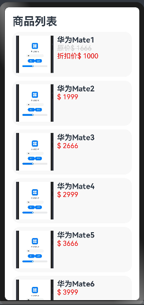
以下是一个简单例子, 具体可以到官方文档查看
class Item {
  name: string
  image: string
  price: number
  discount: number

  constructor(name: string, image: string, price: number, discount: number = 0) {
    this.name = name
    this.image = image
    this.price = price
    this.discount = discount
  }
}

@Entry
@Component
struct Second {
  private items: Array<Item> = [
    new Item("华为Mate1", "https://qiniu.waite.wang/202404182317729.png", 1666, 1000),
    new Item("华为Mate2", "https://qiniu.waite.wang/202404182317729.png", 1999),
    new Item("华为Mate3", "https://qiniu.waite.wang/202404182317729.png", 2666),
    new Item("华为Mate4", "https://qiniu.waite.wang/202404182317729.png", 2999),
    new Item("华为Mate5", "https://qiniu.waite.wang/202404182317729.png", 3666),
    new Item("华为Mate6", "https://qiniu.waite.wang/202404182317729.png", 3999),

  ]
  @State message: string = 'Hi there'

  build() {
    Column({ space: 10 }) {
      Row() {
        Text("商品列表")
          .fontSize(30)
          .fontWeight(FontWeight.Bold)
      }
      .width("100%")

      ForEach(
        this.items,
        (item: Item) => {
          Row({ space: 10 }) {
            Image(item.image)
              .width(100)

            Column() {
              Text(item.name)
                .fontSize(20)
                .fontWeight(FontWeight.Bold)

              if (item.discount) {
                Text(`原价$ ${item.price}`)
                  .fontColor("#ccc")
                  .fontSize(18)
                  .decoration({
                    type: TextDecorationType.LineThrough
                  })

                Text(`折扣价$ ${item.discount}`)
                  .fontColor("red")
                  .fontSize(18)
              }
              else {
                Text(`$ ${item.price}`)
                  .fontColor("red")
                  .fontSize(18)
              }
            }
            .height("100%")
            .alignItems(HorizontalAlign.Start)
          }
          .width("100%")
          .backgroundColor("#f8f8f8")
          .borderRadius(20)
          .height(120)
          .padding(10)
        }
      )


    }
    .padding(20)
  }
}
注意 当不同数组项按照键值生成规则生成的键值相同时,框架的行为是未定义的。例如,在以下代码中,ForEach渲染相同的数据项two时,只创建了一个ChildItem组件,而没有创建多个具有相同键值的组件。
@Entry
@Component
struct Parent {
  @State simpleList: Array<string> = ['one', 'two', 'two', 'three'];

  build() {
    Row() {
      Column() {
        ForEach(this.simpleList, (item: string) => {
          ChildItem({ 'item': item } as Record<string, string>)
        }, (item: string) => item)
      }
      .width('100%')
      .height('100%')
    }
    .height('100%')
    .backgroundColor(0xF1F3F5)
  }
}

@Component
struct ChildItem {
  @Prop item: string;

  build() {
    Text(this.item)
      .fontSize(50)
  }
}

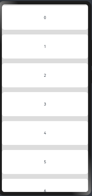
补充: List/ ListItem
在以上案例中, 超出屏幕的内容无法滚动查看(会隐藏), 可以使用 List/ ListItem 组件来实现
// xxx.ets
@Entry
@Component
struct ListItemExample {
  private arr: number[] = [0, 1, 2, 3, 4, 5, 6, 7, 8, 9]
  @State editFlag: boolean = false

  build() {
    Column() {
      List({ space: 20, initialIndex: 0 }) {
        ForEach(this.arr, (item) => {
          ListItem() {
            Text('' + item)
              .width('100%').height(100).fontSize(16)
              .textAlign(TextAlign.Center).borderRadius(10).backgroundColor(0xFFFFFF)
          }
        }, item => item)
      }
    }.width('100%').height('100%').backgroundColor(0xDCDCDC).padding({ top: 5 })
  }
}